NatureZone

Scroll down

Scroll down

Client

Client

NatureZone

Year

Stategy

Concept Development Visual Research Positioning

How can soil regeneration become a visual identity that feels progressive rather than predictably sustainable?

A self-initiated identity and poster series for NatureZone, exploring what sustainability could look like if it stopped looking like sustainability.

Overview

Concept

A self-initiated identity and poster series for NatureZone, exploring what sustainability could look like if it stopped looking like sustainability.

Challenge

Concept

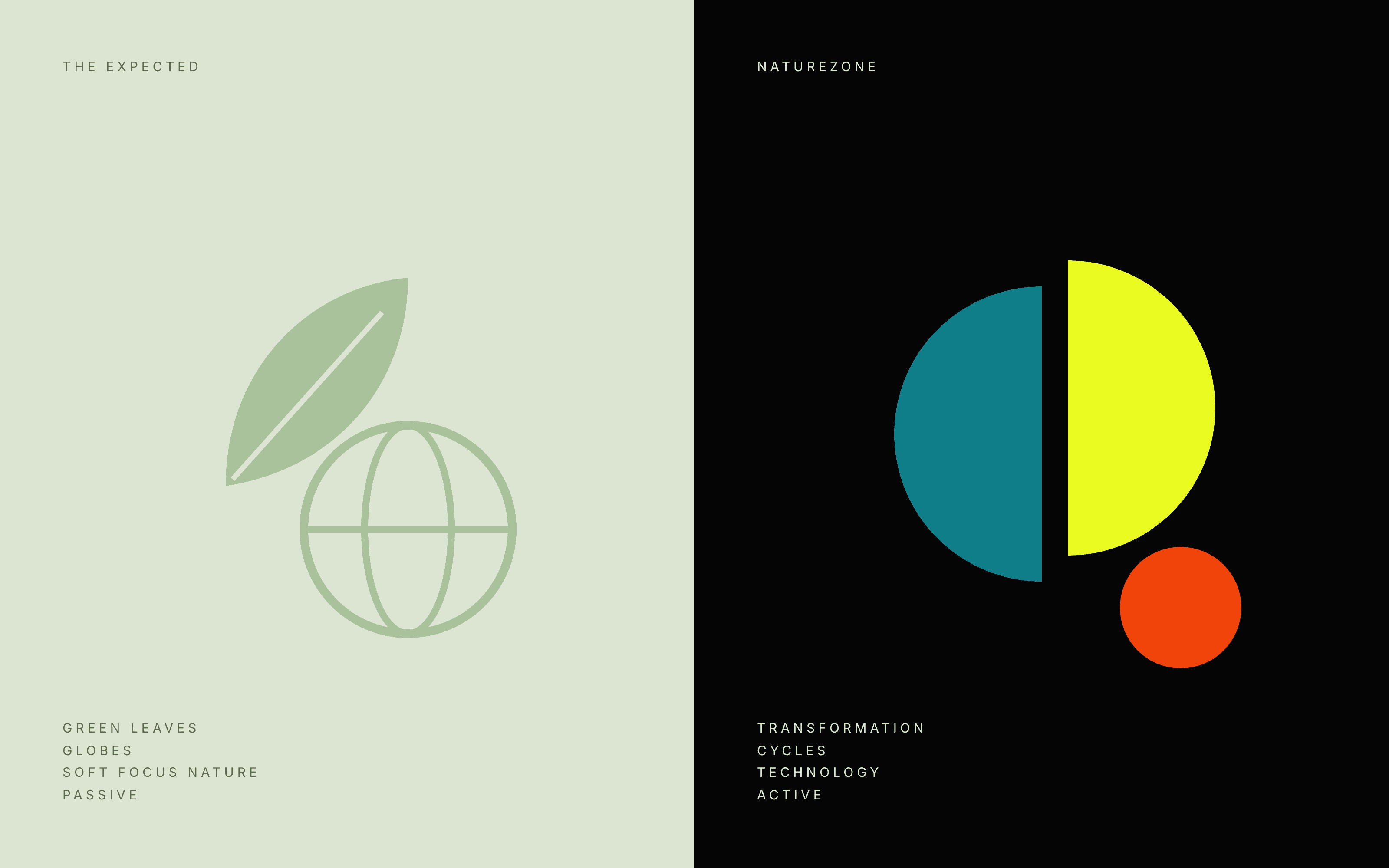
Green leaves. Globes. Soft focus nature. Sustainability has a visual language so familiar it has become invisible. Soil regeneration deserves better: it’s not a gentle story, it’s an active process of breaking down and building up.
Concept

System

Regeneration is transformation, so the identity transforms too. A single circle, standing for the natural cycle, splits, overlaps and evolves across the series. The form doesn’t illustrate the process. It behaves like it.

System

Earthy tones and tactile textures keep the work grounded. Neon lime and black push it forward, borrowing from the language of technology rather than nature. A bold, no-nonsense sans serif keeps the message direct and confident, a deliberate counterweight to the organic forms and textures. One system, six posters. Typography and structure stay fixed; scale, texture and composition are free to move. As the series progresses, compositions open up from dense to spacious, so the series as a whole tells the same story as each poster.

Outcome

A visual system that shows sustainability can feel active rather than predictable, and one concept that stretches across six expressions without losing itself.

Next project